
This Week I Learned: Decoding the Minuscule Ascender Loop in Engrosser’s Script
On this week’s episode of This Week I learned in ES, we’re doing a deep dive on the minuscule ascender.
Straight from the first pages of the Zanerian Manual, and in the words of Earl A. Lupfer, “no other style of script…is as practical and beautiful as roundhand.” And one could say the same almost a hundred years later.
Throughout my study of Engrosser’s Script, I’ve found that the beauty of the script is in the details. For this reason, each week I’ll be sharing my findings and what I’m learning along the way about this beautiful script, starting with the minuscule ascenders.
What is the ascender loop?
The ascender loop is the portion of the minuscule letters that stretches above the x-height space. And in Engrosser’s Script, it tends to go up 2.5-3 spaces.
Foundations and anatomy of the minuscule ascender loop
Let’s start by taking a look at the instructions on how to construct the ascender loop from The Zanerian Manual itself (bottom of page 4). In Lupfer’s words:
The “i” is the foundation of the “l”
See that both sides curve evenly
The top is as rounding as the bottom
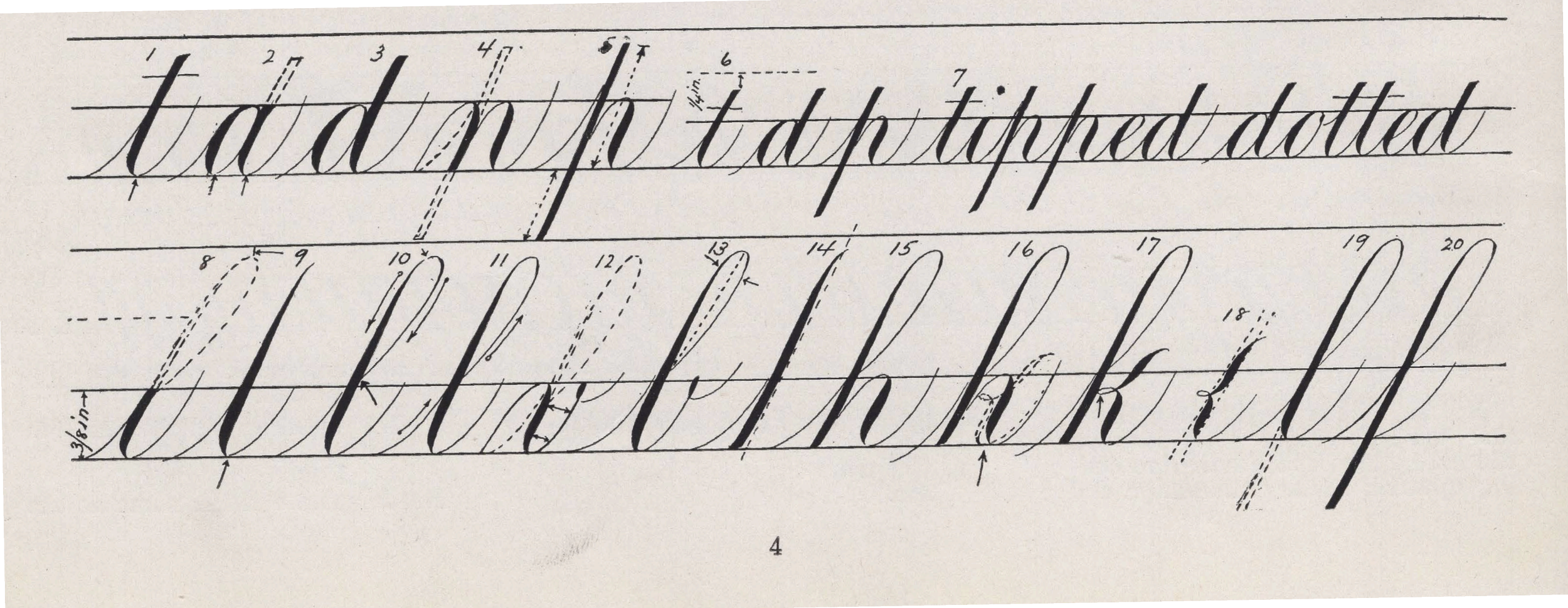
Source: The Zanerian Manual of Alphabets and Engrossing, bottom of page 4
Now before we go into the methods of forming the loop (because there are quite a few ways), let’s look at this checklist and see if we can understand the anatomy.
1. The “i” is the foundation of the “l”
As you see in the diagram below, Lupfer just means that the base width of the minuscule “l” is the same as the minuscule “i”.
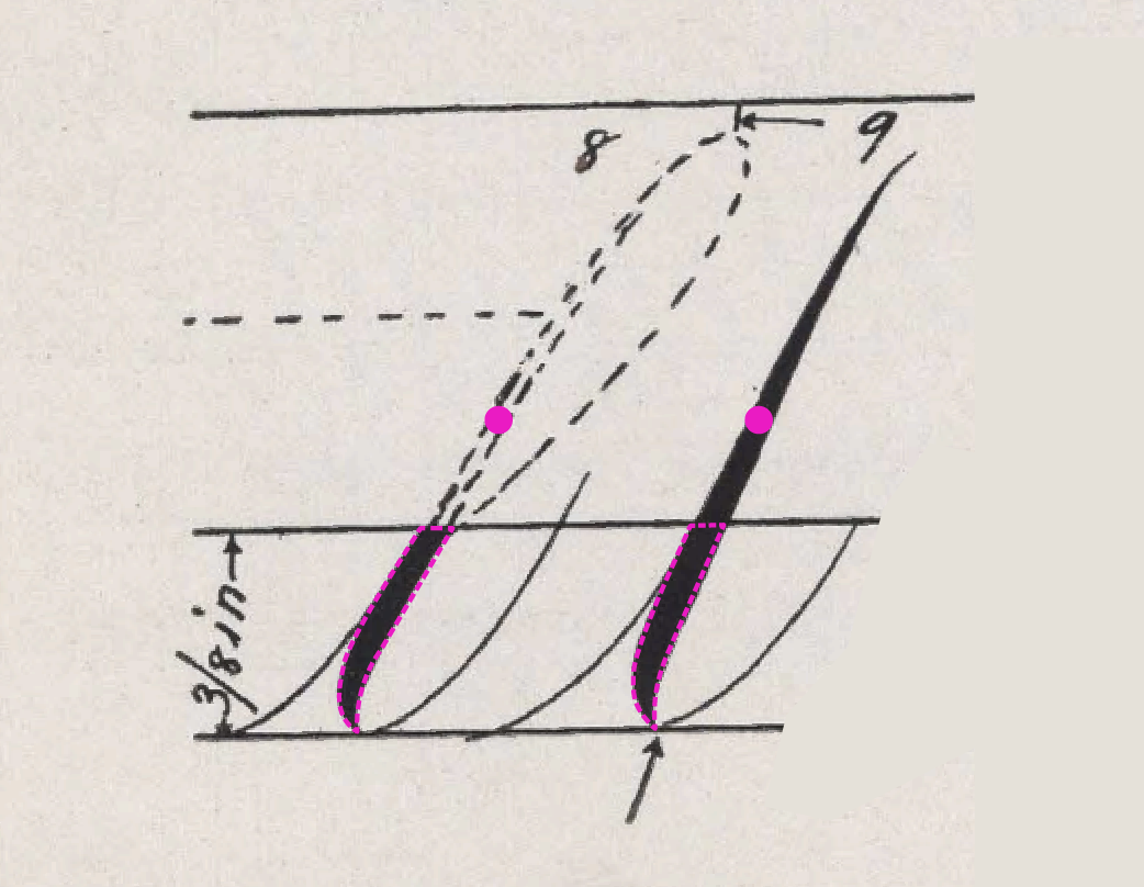
I’ve added pink outlines and a tittle to show how the minuscule “i” is the basis of the minuscule “l” ascender.
2. See that both sides curve evenly
Here, he means that both sides of the loop should be opposite curve reflections of each other
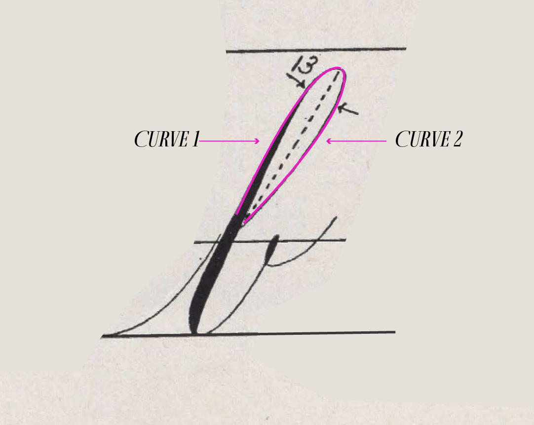
I added pink curves to show that both sides of the loop should be reflected opposites. Note that the Zanerian Manual adds that there is a central axis that should split the ascender loop in half.
3. The top is as rounding as the bottom
Ideally, we see that the top and bottom curves of the letter are similar, if not the same “roundness.” Some calligraphers talk about having a little ball or lemon sitting in the space to help the eye visualize making that apex round and not pinched.
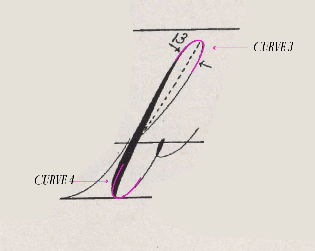
The added pink shows that the top and bottom curve are the same in “rounding” which means that those bowls have an equal or close-to-equal amount of width curvature
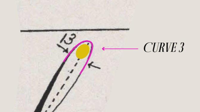
Some calligraphers talk about being able to add a little oval or lemon shape inside their curves to help make their curves rounded
The different ways to construct the ascender loop
Now that we have the foundation, let’s take a look at the ways in which one can construct this ascender loop. As you see at the bottom of page 4, there are two ways to construct this loop
A full complete motion starting from the right hand side and looping to the left into the heavy downstroke.
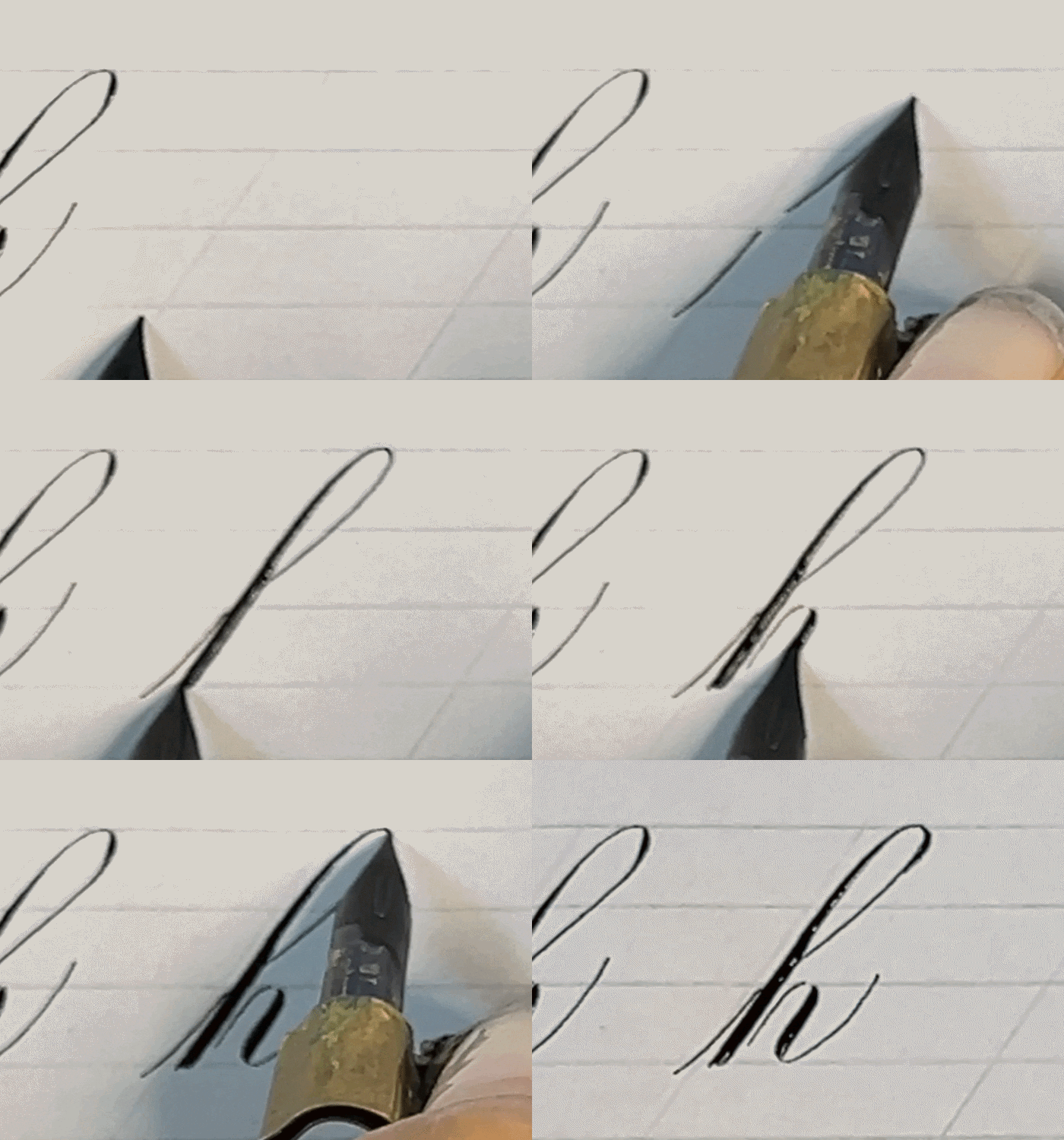
How to complete an ascender loop | Version 1
Drawing the left curved stem first (as seen in #9) and then completing the curve with a light shade on the right
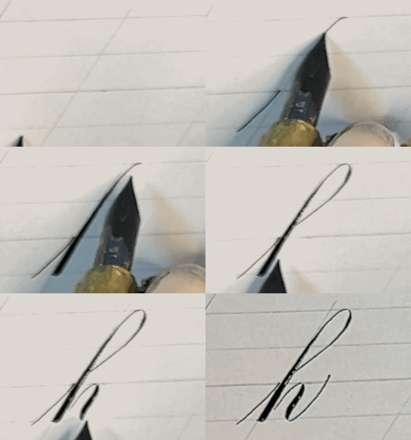
How to complete an ascender loop | Version 2
And in case you were wondering, in his Lessons in Engraver’s Script, Baird does specify that he prefers che prefers constructing the loops the second way. as “he believes that the average person will learn to make good loops in much less time,” but maybe that’s on account “of having learned that way myself, as the best writer of Engraver’s Script that I know of” makes the loops. Here, he’s probably talking about his teacher, Charlton V. Howe.
Now, as someone who has done it both ways during my studies, recently, I had found my loops quite dissatisfying. Why? The look of them seemed almost forced, and I longed to construct the ascender in a more graceful way. That got me thinking…what is the actual shape of the loop stem, and the counter itself?
And like a true designer, I knew I had to get to the bottom of it, so using Illustrator, I traced the inner loop shape, and here is the result.
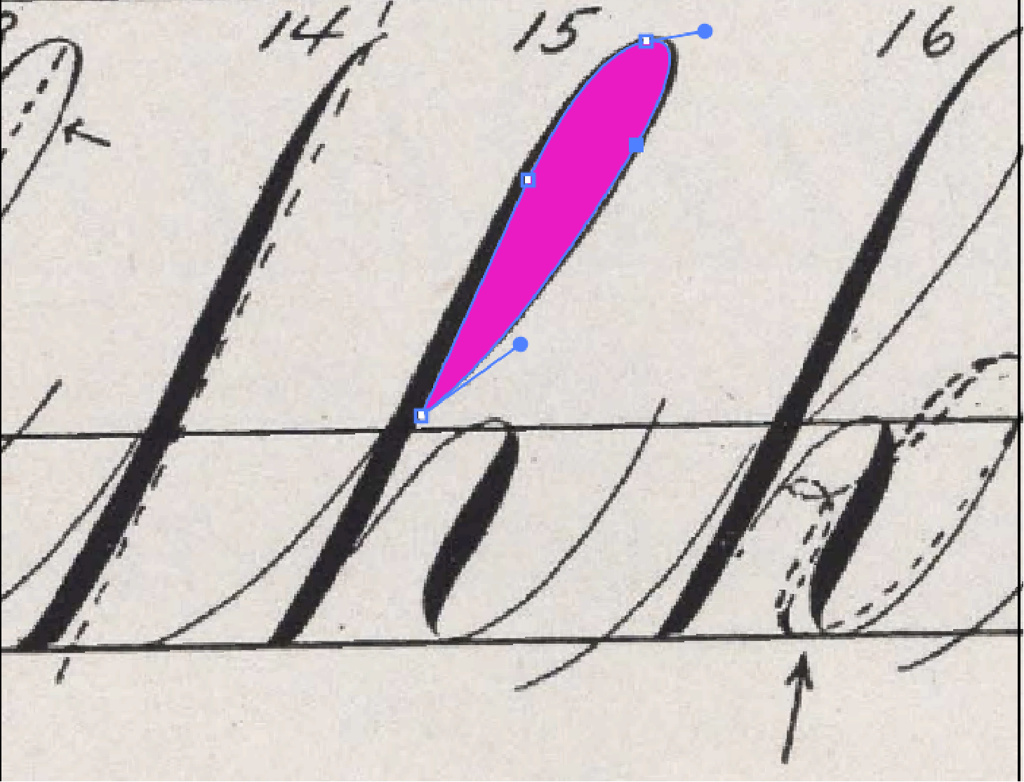
I traced the ascender loop in Illustrator to get an idea of the loop shape

The formed loop shape on its own. Notice that there’s a subtle s-curve to the left portion of the loop if you look suuuuper closely
And, something interesting I noticed while I was putting down beziers was that the left curve had an incredibly subtle s-curve—like, I’m talking minusculic—if that’s even a word. The right side, on the other hand, had a graceful soft curve from top to bottom—or in this case, until it met the stem. Note that when it does meet the stem, it does not match it exactly at the top of the x-height line, but just slightly above.
And when you look at the counter shape, to me, the shape resembles that of a fish.
Plus, if you think about it, you could really add the little fin with the entrance stroke. But I digress—this is serious business after all!
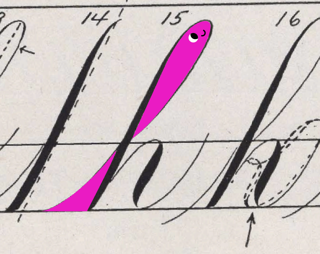
Doesn’t it kind of look like a little fish?
OK—now that we have the loop counter shape figured out, let’s talk about the stem. When you look at the many different penmen and their scripts, you can see the consistencies in this part of the letter. See EA Lupfer, EL Brown and WA Baird below for example. Let’s talk about it. None of these guys had beef (that I know of) so we shouldn’t either.
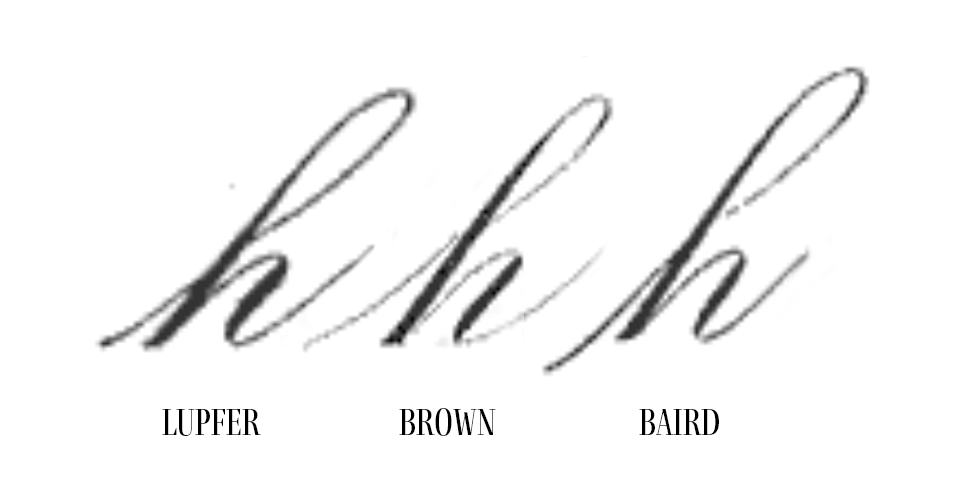
Source: Zanerian.com
If you look at all the exemplars, you’ll see that though the stem has a curve at the top, it ends at the bottom in a rather straight line. You can find more on Baird’s instructions on constructing this shape from the Business Educator.
But wait, there’s more. There’s some added context in his Lessons in Roundhand specimens.
“You will notice that in beginning the loop, the pen at first travels just about as much to the left as it does in a downward direction. Notice also that after the beginning of the shade the stroke is straight. The feature is quite noticeable in the f k and h. The shape of the loop itself is a very important feature and a fault which seems to be a general one is to have a saggy looking loop, which is caused by keeping the loop the same width as almost its entire length. Another fault is to drag the shade on the right side of the loop too far. This shade which should be very slight and kept as close to the top as possible adds greatly to the life of the letter, but if carried down too far, detracts from it.”
FWIW at the end of his lesson, he does say that this is a “hard lesson so work hard to master it,” which is reassuring, for all of us studying this formulaic script.
Let’s dissect these key points from Baird
As your pen rounds the top peak, you must deliberately push it out to the left. This "equal travel" creates a beautifully rounded, open dome at the peak of your loop and avoids a pinched or sharp top.
Once the loop curves over the top and your pen begins moving down to form the main stem of the letter, the stroke must become a perfectly straight line on the main slant angle.
An elegant loop is dynamic—it should be wider at the top and taper down as it approaches the baseline.
In Engrosser's Script, the ascender loop downstroke is usually a delicate, hairline stroke, but this text notes that a tiny, subtle bit of pressure (a shade) right at the top turnaround can add "life." However, if you keep pressing and drag that thickness down into the main stem, the letter becomes top-heavy and unbalanced. The shade must disappear almost immediately as you head downward.
After looking closely at these structural elements, you can really see how it’s all in the details with Engrosser’s Script. And if I’m missing something or didn’t pin down something exactly, let me know! After all, this is a learning journey for all of us and I’m just here to share the insights that I uncover along the way.
To wrap up, here is a short check list for what to keep in mind when you’re practicing ascenders.
Summary checklist for your ascender loop practice:
[ ] Does the top of the loop feel like a balanced curve, not a spike?
[ ] Is the main downward stem straight(ish)?
[ ] Does the loop taper nicely as it meets the stem?
[ ] Is your secondary shade elegant and light?
[ ] Does your ascender loop go all the way up to the second ascender line or close to it?
Want to chat more ES or tell me about your ES learning journey? Send an email! Would love to hear about what you’re learning and how we can continue to learn all about this beautiful script.
Yours very truly,
Handsome Ink