
This week I learned: A Deep Dive into Engrosser’s Script Majusculic Terminal Dots
They’re like tiny ink shoes—and not one size fits all. In this week’s “This Week I Learned” we’ll explore the anatomy of the terminal dots adorning the majuscules, and the ways penmen of the past elegantly finished their calligraphic strokes.
At one point in my life, I was a semi-professional salsa dancer. And though I learned many things (particularly how to perform New York Style Mambo), our director said one thing that has stuck with me ever since.
“Finish your lines!” she would say on repeat. By that, she meant that we girls needed to focus on the way we styled our arms while doing the patterned footwork at the same time. Even if you nailed the pattern, the dancing would look sloppy if your hands weren’t considered—all the way to positioning your fingers in an elegant way. Yes, your fingers!
And though most of the day we’re focused on getting the footwork right, true professionals pay equal (if not more) attention to final touches. The foundation becomes second nature, and the artistry unfolds in the details.
This is a long way of saying that Engrosser’s Script is exactly the same. We might get in the weeds ensuring our downstrokes are consistent—but have we stopped to study the nuanced elements that create the script’s elegance? Like the terminal dot?
Today we’ll do just that: a deep dive into these often-overlooked details. Because let’s face it — to bring something extraordinary to life, one must consider everything.
Why terminal dots matter
As always, let’s start by looking at the Zanerian Manual:
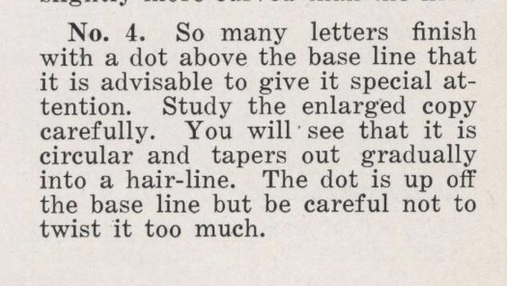
Source: The Zanerian Manual, page 5 | EA Lupfer
Lupfer certainly had thoughts. In his words, “so many letters finish with a dot above the base line that it is advisable to give it special attention.”
(!!!) Notice how he says special attention?
“Study the enlarged copy carefully. You will see that it is circular and tapers out gradually into a hairline. The dot is up off the base line”
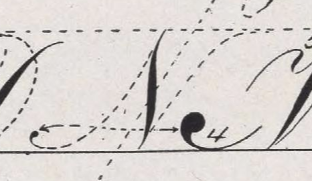
Source: The Zanerian Manual, page 5 | EA Lupfer
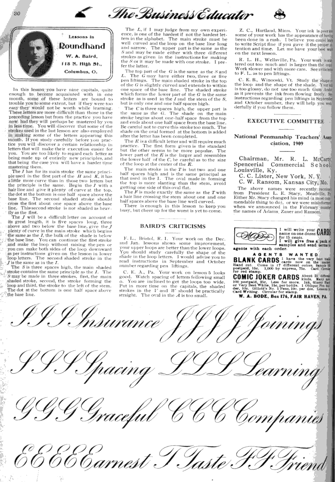
And from Baird himself:
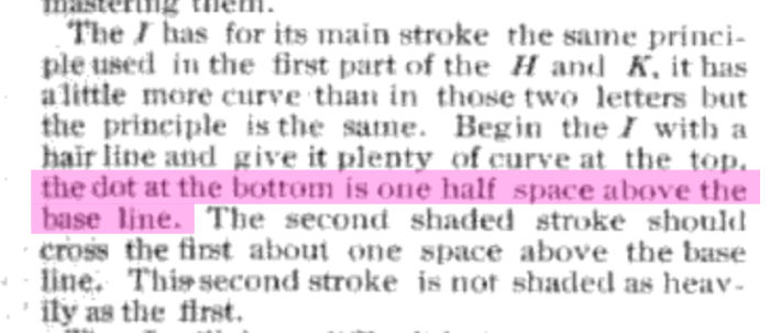
Source: Lessons in Roundhand, Lesson 7, The Business Educator | WA Baird
“The dot at the bottom is one half space above the base line.” Let’s look at that.
By that he’s saying that the terminal dot should rest about halfway into the x-height space.
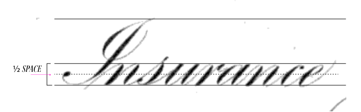
Source: Lessons in Roundhand, Lesson 7, The Business Educator | WA Baird
After reading this, I looked at some of my most beloved exemplars, and lo and behold—these other penmen were following suit. I was honestly a bit shook, as the kids say. These masters of the craft followed a formulaic approach to create beautiful handwriting. What seems like purely organic script is built on methodical steps—and as a generation that has largely lost the art of penmanship, this matters now more than ever.
The Shape and Consistency of Terminal Dots
Now that we have the placement of the dot, let’s talk about the shape.
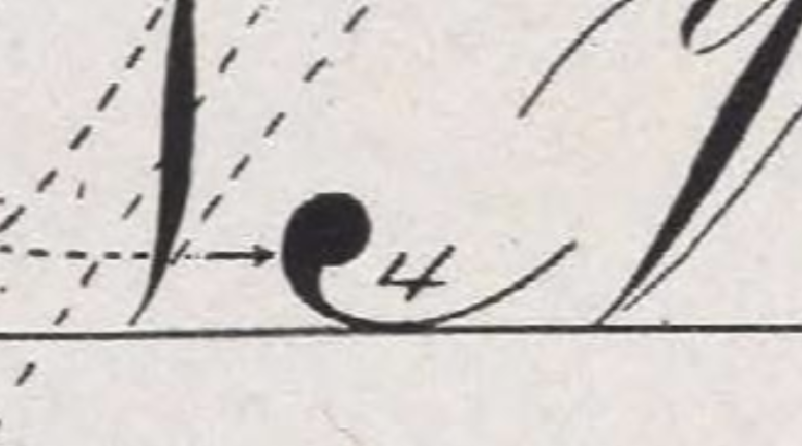
Source: The Zanerian Manual, page 5 | EA Lupfer
Looking at it on a zoomed-in scale, you can see that the terminal dot certainly still has that classic “dot” quality.
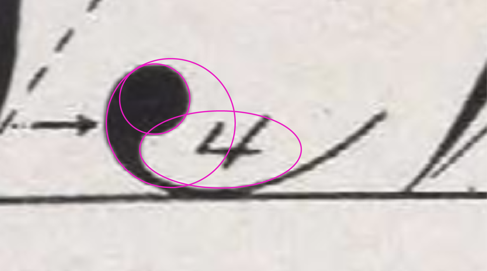
Source: The Zanerian Manual, page 5 | EA Lupfer
Notice how the circular form comprises the beginning of the shape.
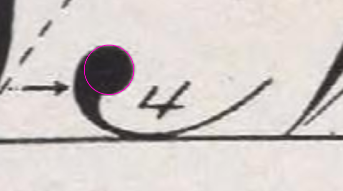
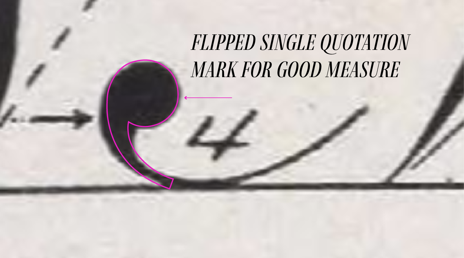
Source: The Zanerian Manual, page 5 | EA Lupfer
When you think about it, the shape as a whole resembles a single flipped and reflected quotation mark.

Still not exactly the same, but a helpful visual cue for all of us.
Source: The Zanerian Manual, page 5 | EA Lupfer
And yep—you guessed it. When you compare the size of that terminal dot against the tittles (the dots above i’s and j’s) in the same word, they’re exactly the same size. Prettttty cool!
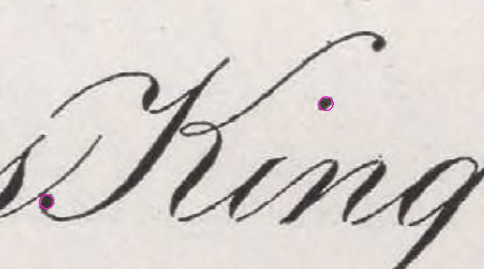
Source: The Zanerian Manual, page 6 | EA Lupfer
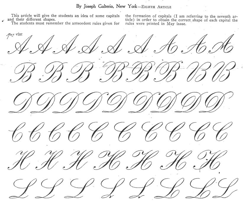
Like every penman adding their own zest, some of the greats made stylistic adjustments to the terminal dot. Take Joseph Galterio, for example. Unlike Lupfer’s versions, his have a more pronounced curly quality, with the terminal dot curving back more distinctly into the majuscule stroke.
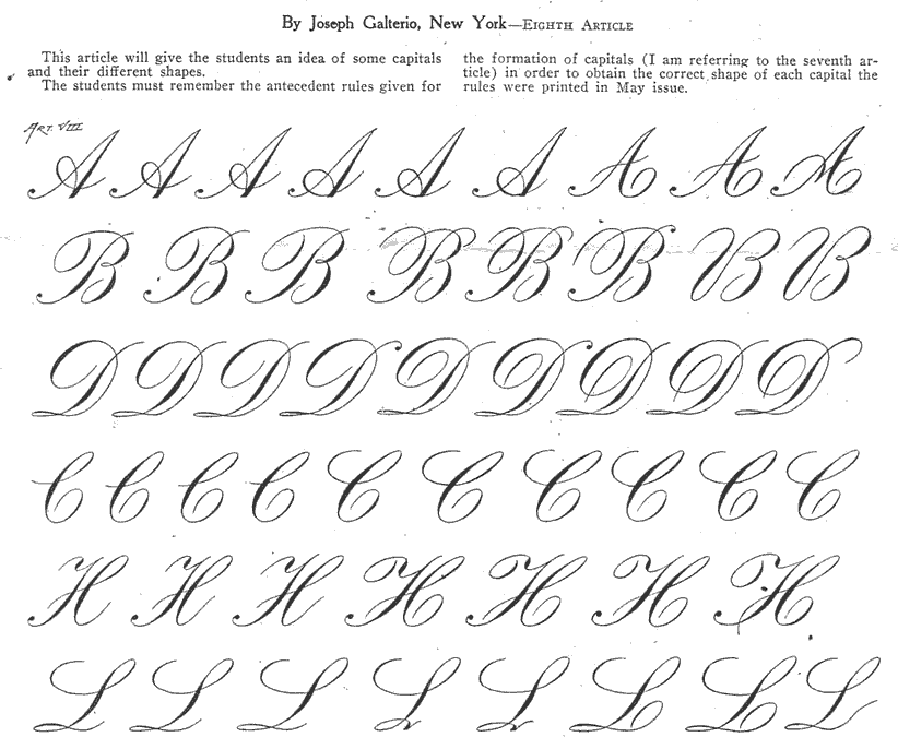
Source: Joseph Galterio, Eigth Article | Joseph Galterio
In some instances, the penman chooses to make the swell less like a perfect dot and more like a rounded triangle.
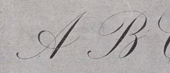
Source: The Zanerian Manual, page 19 | CP Zaner
Here, C.P. Zaner executed the terminal dots with precise placement but opted for a less rounded form. To each their own, as they say.
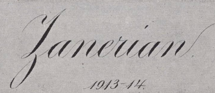
Source: The Zanerian Manual, page 19 | CP Zaner
It’s worth noting that this stylistic choice carries across the rest of his exemplar—his tittles follow the same shape, giving the finished piece a beautifully consistent look.
And though other penmen from that era might stray from the strictly circular dot, the result is no less excellent.
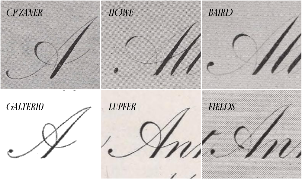
Source: The Zanerian Manual and Zanerian.com
You get the gist—at the end of the day, as long as the placement is intentional and the style matches the rest of the exemplar, the finished script will look complete and harmonious.
Summary checklist for your terminal dot practice:
To sum it up, here are some things to consider when constructing your terminal majusculic dots:
[ ] Do you place the terminal dot ½ of the x-height above the baseline?
[ ] Are you creating a single quotation-mark-like shape that tapers into a thin stroke?
[ ] If using a dot or a different terminal shape, do your letters (especially tittles) use the same look for consistency?
I hope this week’s observational study was helpful, and that you continue to discover the quiet beauty within Engrosser’s Script.
Any other observations I missed? Let me know in the comments!
Happy Engrosser’s Scripting! (I should really come up with a catchier sign-off)