
This Week I Learned: Materials of the Zanerian College of Penmanship
The Zanerian College of Penmanship was established in 1888 in Columbus, Ohio and was recognized as the leading school of penmanship and engrossing in America at the time.
In this week’s episode of “This Week I Learned,” we’ll go through the materials that were required for the students of the Zanerian College and the master penmen of the past.
We’ll look at the supplies recommended for practice like the papers preferred, the inks they mixed, the penholders, the pen points, and what any of this still means for us today.
Types of paper used in the Zanerian College
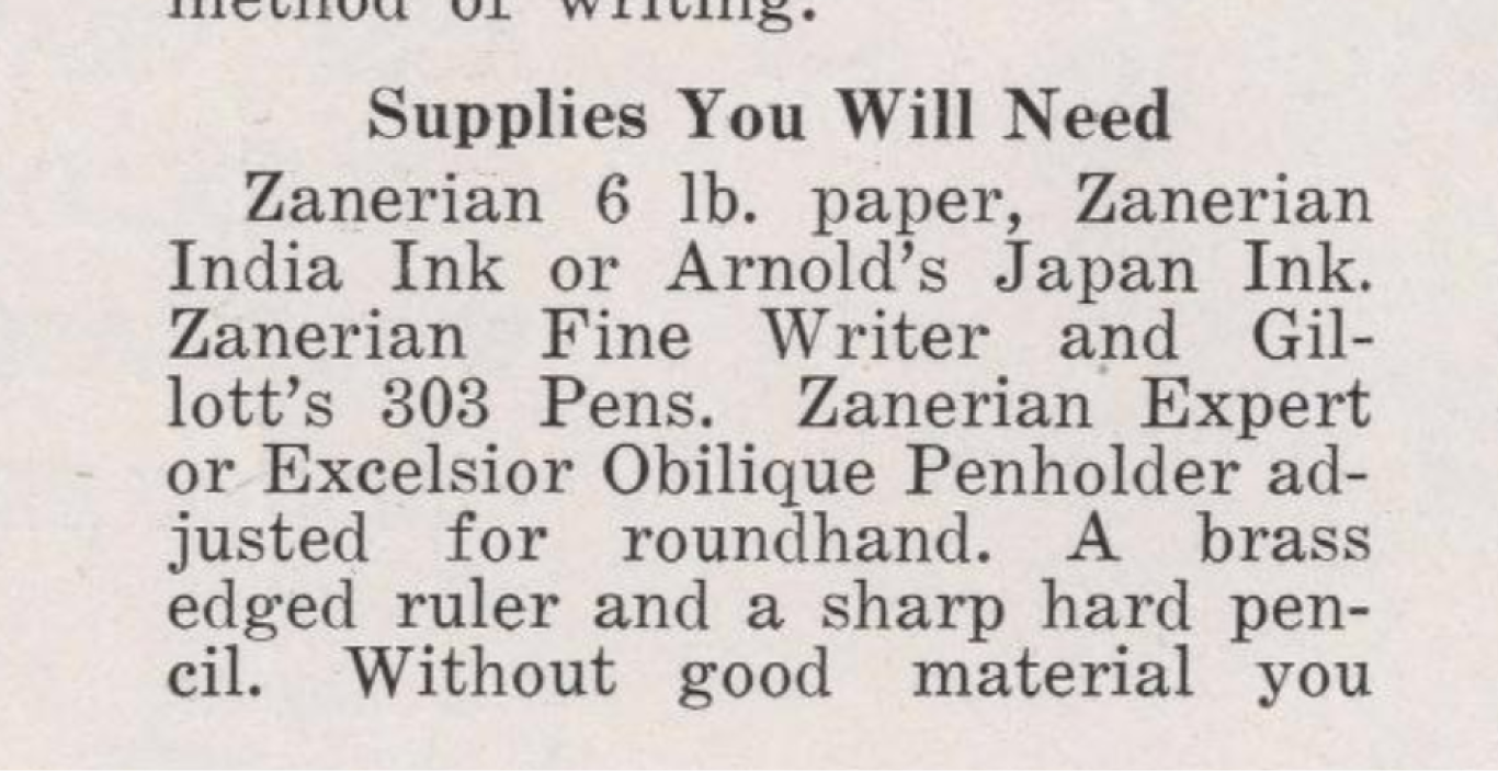
Source: The Zanerian Manual of Alphabets and Engrossing, 1924
Looking into a couple of editions of the Zanerian Manual, I realized that my 1981 version called for 5lb paper instead of the 6lb paper the 1924 edition called for. The reason? One might never know. But let’s look at each of these two papers and from their ads and what they were good for.
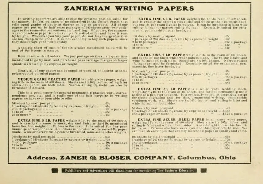
“Medium Grade Practice Paper is a white wove paper, weighing 6lb. to the ream of 480 sheets. Sheets are 8×10 ½ inches, ruling faint and wide (½ inch) on both sides. Narrow ruling (⅜ inch) can also be furnished if desired. This is good paper for general penmanship practice work, correspondence use, etc., and is really one of the best bargains in writing papers we have ever been able to offer.”
“Extra Fine 5lb Paper weighs 5lb. to the ream of 480 sheets, and is exactly the same in stock, size and finish as the 6lb. mentioned hereafter, but weighs one lb. less to the ream. It is suited for fine penmanship, correspondence, etc. There is no better white wove 5 lb paper made. Wide or narrow ruling can be furnished same as other weights.”
Note that 100 of these sheets cost about 60 cents at the time The Business Educator, Vol. 17 was published in January of 1912—an equivalent to $24 in today’s dollars.
Given that the Medium Grade is specifically described as good for “practice work,: it seems the more likely everyday choice at the College.
What does the weight of paper mean?
According to Strathmore, “paper weight in the US is stated in lbs. and is determined by weighing 500 sheets (a ream) in the basis size of a particular paper.” The more you know!
A personal account of the materials actually used at the college
While researching, I remembered that my mentor Holly (hi Holly! 👋) had given me an article when I first started studying Engrosser’s Script with her. It was published in Bound & Lettered Volume 11, Number 2 (2014) and written by her father, Cliff Mansley, a second-generation calligrapher (and graduate of the college!).
In “The Zanerian Experience,” Mansley writes that Lupfer “introduced us to the various materials used at that time. While the favorite paper was Crane’s Parchment 57# weight, most of our practice at the school was done with a tablet of special paper formulated by the Zanerian College to have just the right tooth. By practicing with this ruled tablet, we were spared lining up page after page for lettering.”
Mansley is almost certainly referring to the Zanerian practice papers mentioned above. Though that mention of Crane’s Parchment 57# sent me looking for the modern equivalent.
A call to Crane’s and a conversation with Courtney (the representative there) later, I received the news: “We’re no longer making that paper—it hasn’t been produced for about two decades.” Womp.
Thankfully, Jenna came to the rescue. Jenna is the museum director of the Crane Museum of Papermaking. She explained that paper is made by beating fiber into pulp, adding water, then removing it. The weight depends on how much pulp is allowed onto the screen—a heavier paper simply receives more pulp. Crane uses cotton and linen, or 100% cotton. Calendaring (pressing the dry sheets between metal plates) controls the finish: heavily calendared sheets are very smooth, while lighter calendaring leaves more tooth.
Because Mansley’s paper was labeled ‘parchment,’ it likely received a high degree of calendaring to create a smooth, vellum-like surface. A more in-depth and proper explanation can be found here.
This also matches the description in the New Zanerian Alphabets: “Paper should be of a fine letter quality, bond, wedding or cardboard. Thin, cheap, soft paper should be avoided.”
All of this information gave us some context that the 57# would refer to the weight, and the parchment label would refer to the texture or finish. And this helpful resource can tell us that 57 weight would come under a traditional lightweight card stock, making it much thicker than premium quality print paper and lighter than premium heavy card stock.
Modern takeaway: Look for a smooth, fine letter-quality paper with enough tooth to take a fine hairline but not so soft that it feathers. Here are some favorite contemporary papers from the local calligraphy community:
The Inks of the Zanerian College
All this talk about paper is the perfect segue to—yep, you guessed it—inks!
The Zanerian Manual called for two different inks: Zanerian India Ink or Arnold’s Japan ink (though my later 1981 edition calls for Arnold’s Black Ink).
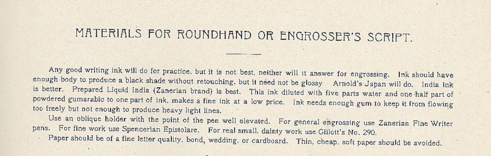
Source: The New Zanerian Alphabets, page 5
A Zaner & Bloser publication put it this way: “Any good writing ink will do for practice, but it is not best…for engrossing. Ink should have enough body to produce a black shade without retouching, but it need not be glossy. Arnold’s Japan will do. India ink is better. Prepared Liquid India (Zanerian brand) is best. This ink is diluted with five parts water and one-half part of powdered gum arabic to one part of ink…Ink needs enough gum to keep it from flowing too freely, but not enough to produce heavy light lines.”
This got me curious, could one realistically make their own Zanerian India Ink at home?
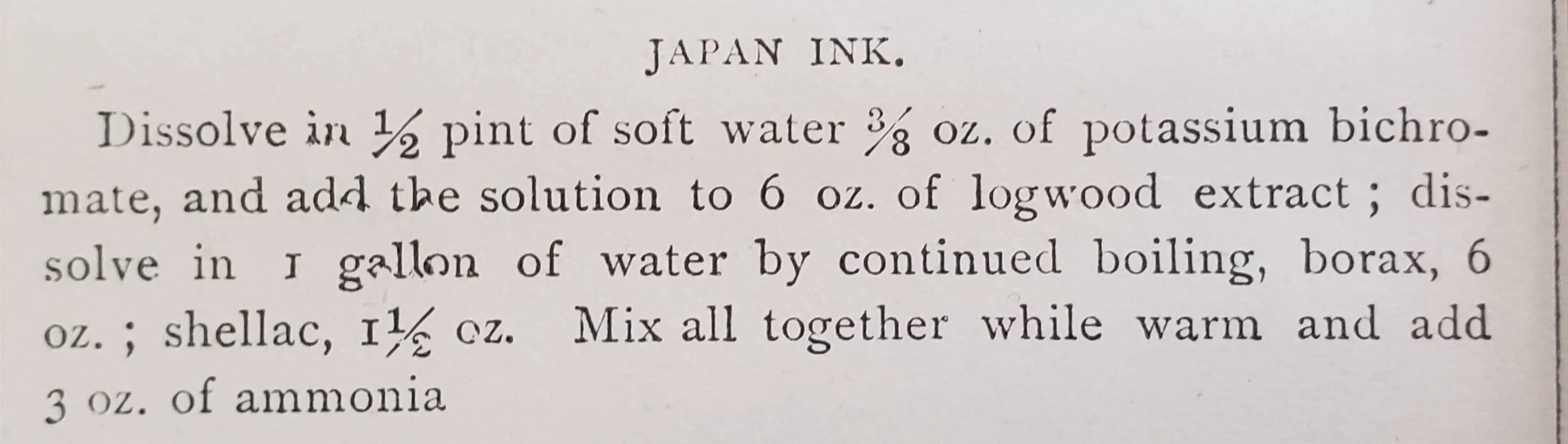
The Zanerian mixing recipe according to The New Zanerian Alphabets
If you are using high-quality India ink today, you can mimic the Zanerian College's classic formula for funsies:
Take 1 part of your high-quality India ink.
Add approximately 4 to 5 parts distilled water.
Add a small amount of gum arabic. (This prevents the ink from flowing too freely from your fine-pointed nibs while maintaining the crispness of your lines)
But what about Arnold’s Japan Ink?
Arnold’s Japan Ink
Arnold’s Japan Ink was a famous 19th and early 20th-century commercial ink manufactured by P. & J. Arnold in London. Before the 1840s, ink was often sold as a solid or powder. By the mid-1800s, pre-prepared inks in glass or stoneware bottles became common.
The “Japan” in “Arnold’s Japan Ink” likely came from its glossy sheen, a possible nod to japanning, (the European process of imitating Japanese lacquerwork). Vintage recipes also often included shellac, which made the ink dry to a high-gloss finish.
Source: Thanks to Mike W. for procuring this in the Creatrium Discord
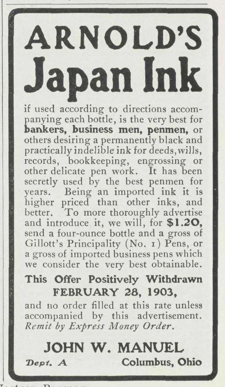
Source: The Western Penman, Feb 1903, Thanks to Ross for procuring this ad in the Creatrium Discord
In his book, Bookbinding and the Conservation of Books : A Dictionary of Descriptive Terminology, Matt Roberts puts it this way: “there is also the so-called Japan ink, which consists of almost completely oxidized iron tannate with large proportions of gum, which gives a black glossy effect immediately.” Note: large proportions of gum.
Separately, Mansley noted that one of the things that fascinated him on Mr. Lupfer’s desk was his ink. “For whatever reason, the ink would become moldy…he would scrape off the mold off the top of the ink and then dip a piece of tissue into the ink to get the residual mold to cling to the tissue, thus removing it.”
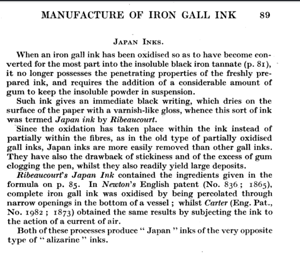
Note that the above recipe mentions that there is a drawback to Japan ink—the stickiness and the excess of gum clogging the pen.
Japan ink wasn’t the only Arnold product the penmen reached for. They often mixed it with something else entirely.
Arnold’s Writing Fluid vs Arnold’s Japan Ink
Writing fluid flowed freely and produced ultra-fine hairlines but went down pale and blue-green before drying to a flat black. Japan Ink was intensely black and glossy yet too thick on its own—it dragged and clogged fine nibs. By combining the two, penmen got the best of both worlds: super-thin hairlines with a glossy result.
Madarasz himself would do this very same thing and mix Arnold’s Japan Ink with Arnold’s Writing Fluid.
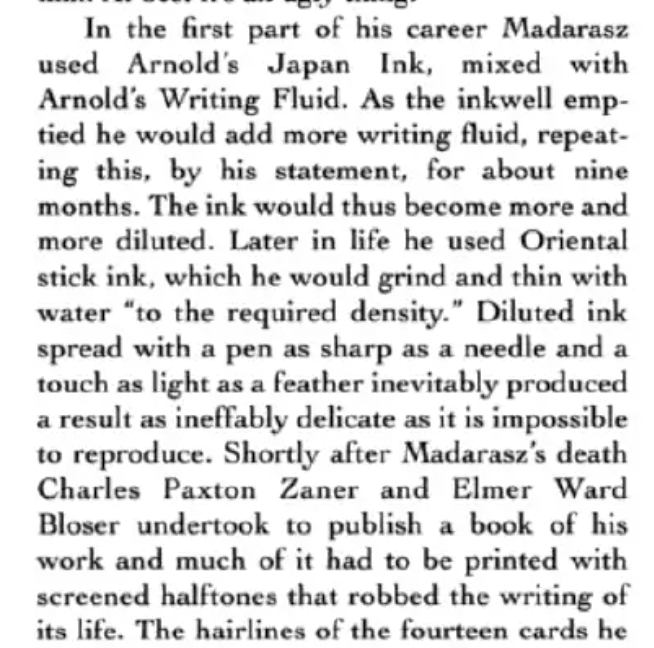
Source: An Elegant Hand, William Henning, page 34
Writing Fluid flowed beautifully and produced ultra-fine hairlines, but it went down pale and blue-green, drying to a flat, matte black.
Japan Ink was intensely black and glossy, yet too thick on its own—it dragged, clogged fine nibs, and made clean hairlines difficult.”
By combining the two, penmen could use an ink that gave super thin hairlines yet produced a glossy result. Win-win!
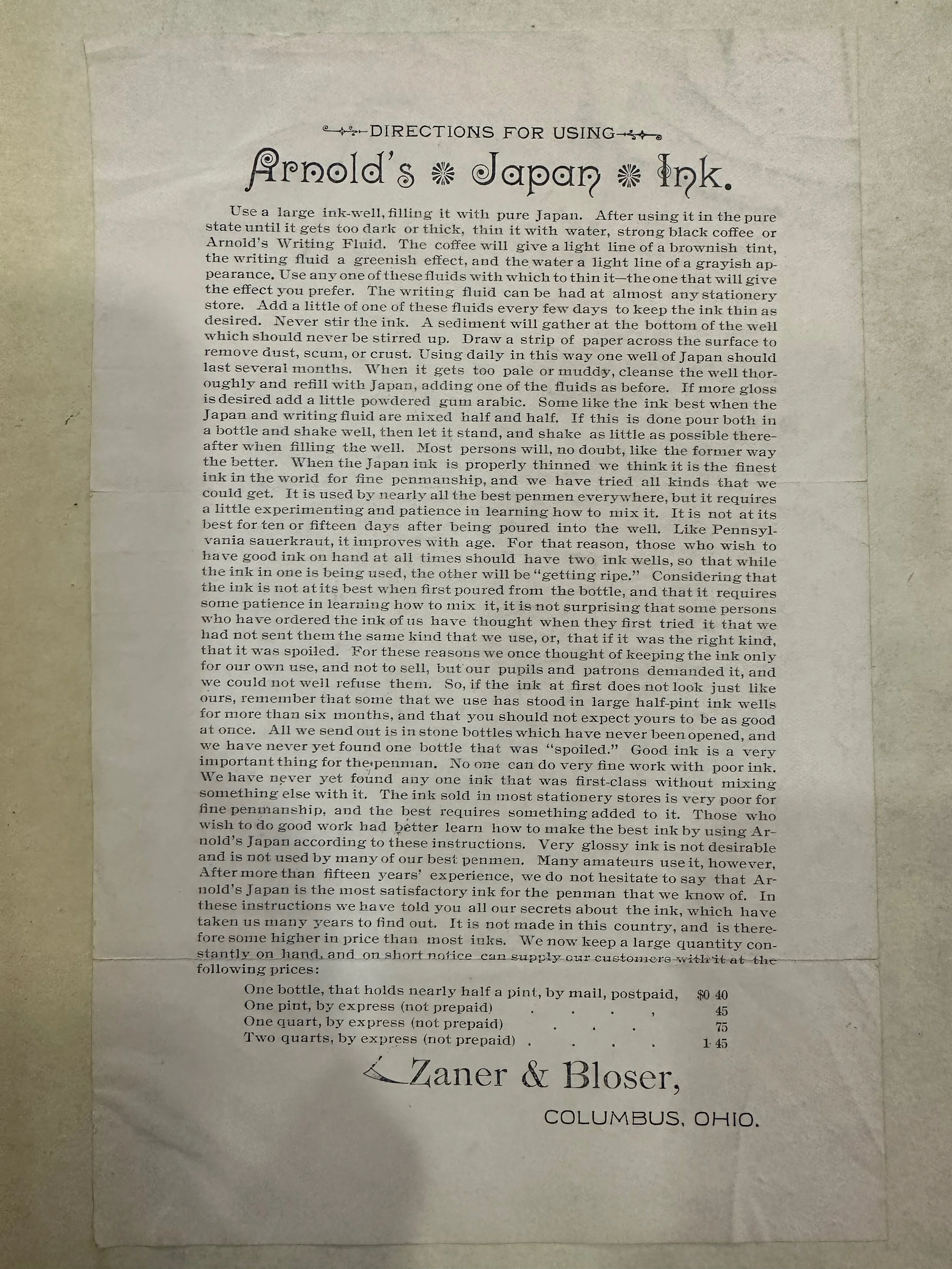
Source: The Newberry Library, Thanks to Gray H. for procuring this in the Creatrium Discord
A Zaner & Bloser ad even claimed that when Arnold’s Japan was properly thinned with Arnold’s Writing fluid or coffee (yep!), they claimed it to be “the finest ink in the world for fine penmanship. It gets better with age, just like Pennsylvania sauerkraut.” I’d never thought I’d be comparing my ink to a fermented pickle, but here we are.
This also matches what Mansley’s description of Lupfer scraping the mold from the top of his aged ink before use.
Ink Comparison Chart
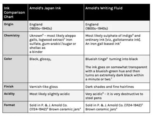
Sources:
2. Courtesy of Mike W, Creatrium Discord
3. Matt Roberts: Bookbinding and the Conservation of Books : A Dictionary of Descriptive Terminology
4. https://chrisraper.org.uk/blog/vintage-antique-ink-bottles/
5. https://ljacatc.berea.edu/pawtucket/index.php/Detail/entities/2023
Modern takeaway: Many of us still reach for high-quality India or Sumi inks and adjust flow with a touch of gum arabic or water. These are the same principles the Zanerians followed more than a century ago. Here’s what contemporary calligraphers have on their desk:
Walnut Ink (Tom Norton, Daniel Smith)
Iron gall Ink (Fox & Quills, McCaffery's, Rohrer & Klingner)
Sumi Ink (Moon Palace, Boko-Undo Saiboku Aya Ink Sticks)
Zanerian Fine Writer Nib
According to Brian Walker, between roughly 1850 and WWII, Joseph Gillott produced his very best pen point. Enter, the Gillott No. 1 Principality. This nib was almost exclusively exported to the United States and became the pen nib used by the great American master penmen and was the nib that gave Ornamental Penmanship its distinctive character, being so sharp as to produce incredibly fine hairlines, yet flexible enough to produce broad strokes.
Custom "Imprint" Nibs
Hurford remarks that the Gillott No.1 Principality was so popular that it spawned at least two clones also made by Gillott. They were the Zanerian Fine Writer and the Tamblyn #7.
British manufacturers like Gillott held the precision tooling and steel-tempering technology required to make hyper-flexible, razor-sharp dip nibs. American penmanship schools and master penmen would commission "imprint" versions of existing English nibs stamped with their own brand name like the Zanerian Fine Writer.
“Bronze, sharp and elastic” says Calligraphic Arts, the Zanerian Fine Writer was a sight to be seen. According to catalogs of the past, “pens of the Zanerian brand [were] the highest grade that [could] be secured, being made from the very best material by the most skillful pen makers in the world.” Talk about high-quality!
One gross of these nibs (144) was $1.75 which would be about $35 dollars today.
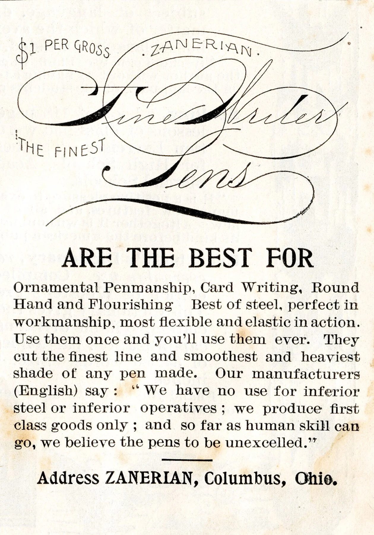
Source: Penman’s Art Journal, 1895, procured by Ross in Creatrium Discord

Source: A Look at Fine and Flexible Nibs, Bob Hurford “An ad for the Zanerian Fine Writer from the 1928 Zaner-Bloser catalogue.
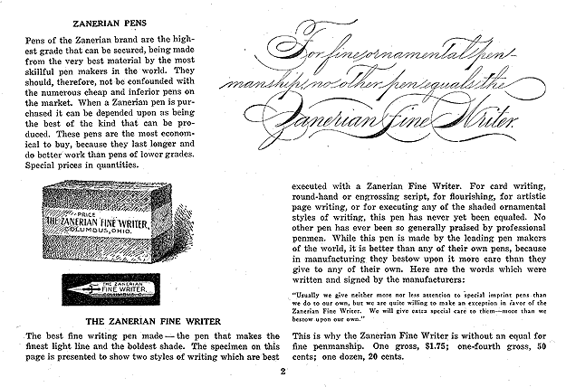
Source: Zanerian.com
Gillott 303
The Zanerian Manual also mentions Gillott’s 303 pen points. Hurford says that the Gillott 303 “is a pen that will produce a finer hairline than the 604EF, but the tines are not designed to spread as wide.”
Thankfully for us, the Gillott 303, now has a modern version in a blueish metal hue.
Modern takeaway: Though some of these nibs are coveted, rare and vintage, we can still experience modern pen points that can give us fine hairlines with flexibility.
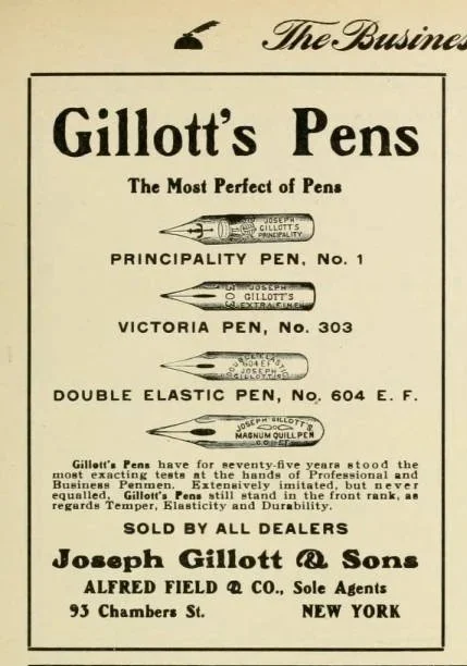
Source: The Business Educator
penholders used at the zanerian college
Lucky for the Zanerians, most of their materials were easily accessible, as they were produced by the college. The college and the Zaner-Bloser Company were in the same building after all. “The downstairs consisted of business offices, the studio and a shipping and receiving area. The second floor had two large classrooms with seating each for about thirty students. In addition, the third floor had facilities for making and painting wooden penholders. The penholders were rough turned on a lathe, and then put into a large tumbler,” Mansley recounts.
This recollection plus this vintage Zaner-Bloser ad gives us a glimpse into the penholders they offered and recommended in the Zanerian Manual—the Expert and the Excelsior.
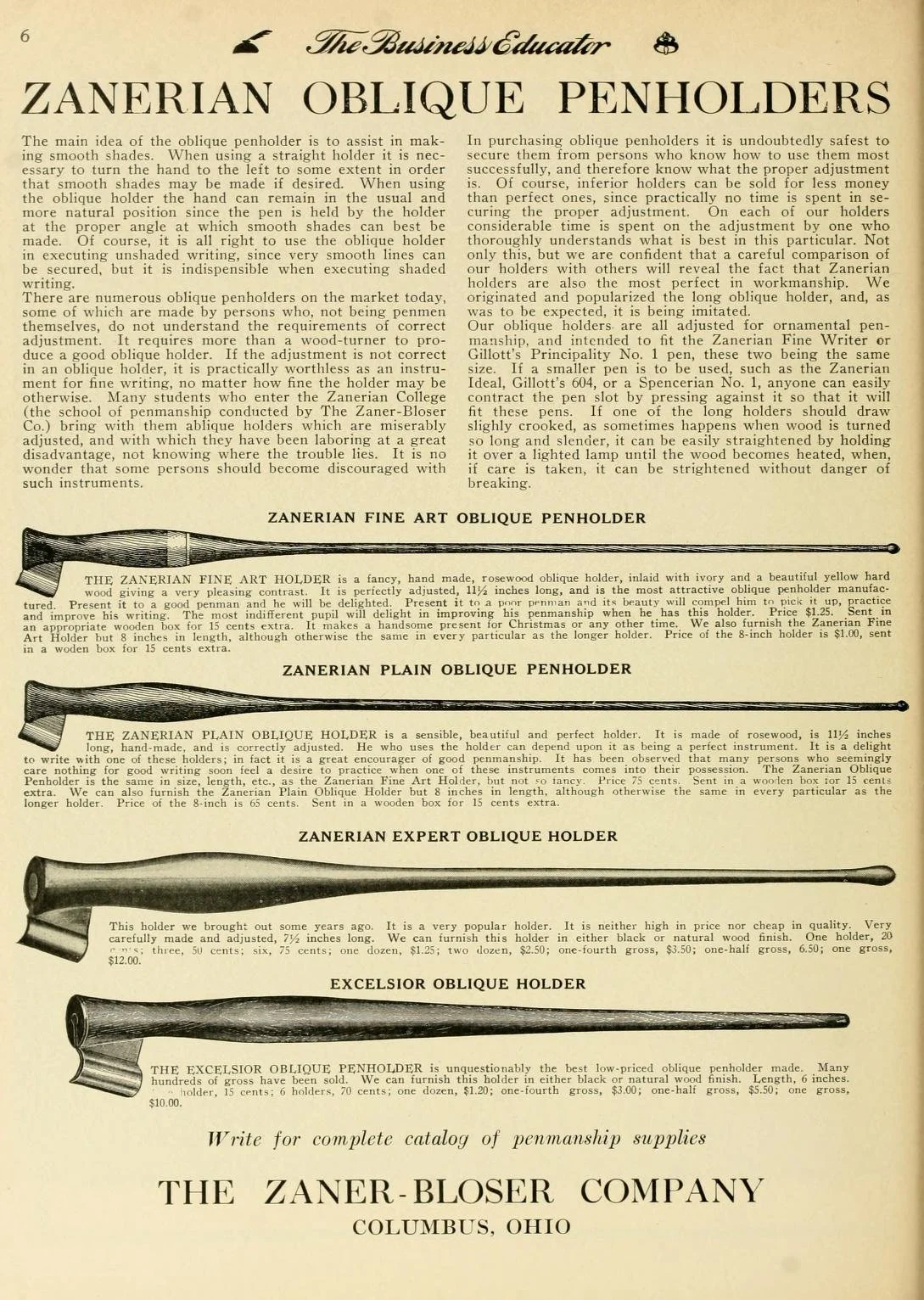
Zanerian expert: “This holder we brought out some years ago. It is a very popular holder. It is neither high in price nor cheap in quality. Very carefully made and adjusted 7 ½ inches long. We can furnish this holder in either black or natural wood finish. One holder, 20 cents; three 50 cents; six, 75 cents, one dozen, $1.25; two dozen, $2.50; one fourth gross, $3.50; one-half gross, $6.50; one gross, $12.00.”
Zanerian Excelsior Oblique pen holder adjusted for roundhand: “The Excelsior Oblique Penholder is unquestionably the best low-priced oblique penholder made. Many hundreds of gross have been sold. We can furnish in either black or natural wood finish. Length, 6 inches. One penholder, 15 cents; 6 holders, 70 cents; one dozen, $1.20; one-fourth gross, $3.00; one-half gross, $5.50; one gross, $10.00.”
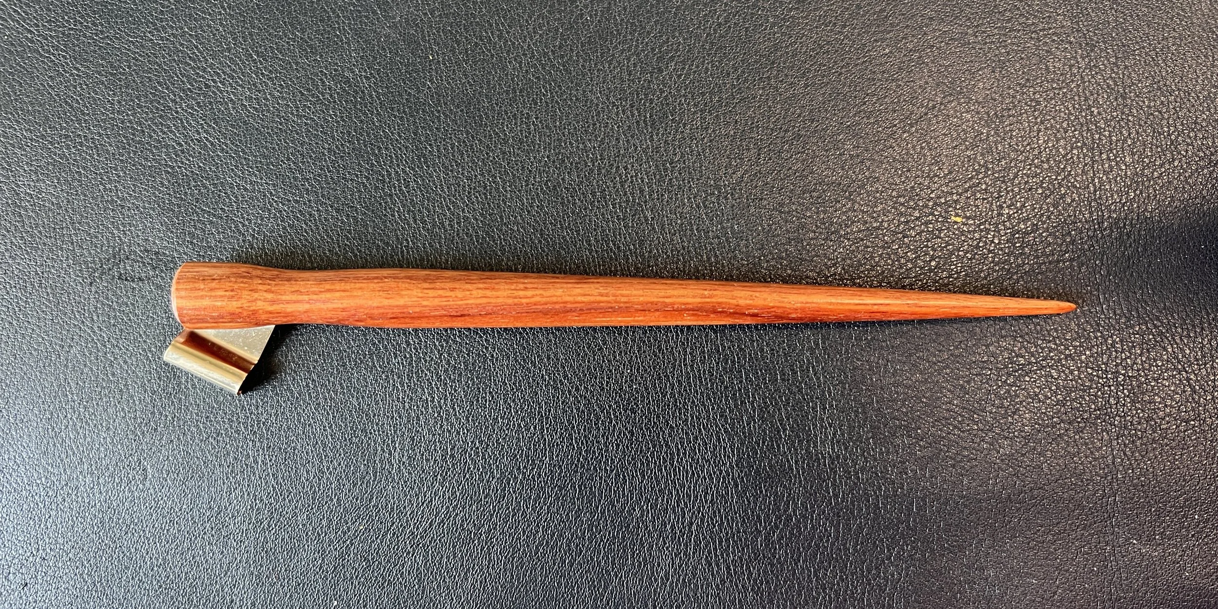
An Excelsior replica in our collection purchased from Colby Cline
As these penholders were accessibly priced (15-20 cents in 1929) which is roughly $3-4 in today’s dollars. It was no wonder that the Zanerians opted for a penholder made-in house for their practice.
Modern takeaway: Lucky for us, there’s a myriad of penholder options for us today made by talented contemporary penmakers.
A hard pencil and a brass edged ruler
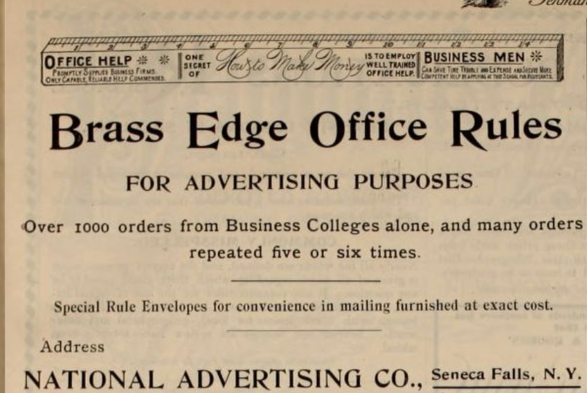
The last supplies required on the list? A hard pencil and a brass edged ruler. Why a hard pencil? Hard pencils (marked with an “H,” such as 2H) leave a lighter mark than softer “B” pencils.
Using a hard pencil meant that the blackness would be lighter, therefore leaving a fainter mark for guidelines on the desired paper. And because “B” pencils are meant to leave a darker mark, they might leave more graphite that could be harder to erase than a crisp H pencil. An extra unwanted job (and mess to clean up) for a busy calligrapher.

Source: The New Zanerian Alphabets, page 6
Paired with a brass-edged ruler, a hard pencil allowed Zanerian students to rule straight, faint guidelines quickly and create a clean foundation for their lettering.
What this means for us today
And though most of these original materials are no longer available, we can be certain that these vintage supplies can give us some insight into finding some modern alternatives, or even understanding the materials necessary to carry out such prolific work.
Upon reading some of these publications of the past, one thing is certain.
It is repeated over and over that one must find and begin with good materials in order to execute an excellent result.
I hope that this week’s deep dive has given you some insight into the weight that these small but mighty foundations can make on one’s penmanship practice. So that next time you sit down at your desk to practice, you can be grateful and appreciative for these pen-adjacent extensions that can make or break your next penmanship session.
Yours very truly,
Handsome Ink